2019-09-13
Interactive plots for blogging
Using Plotly, Bokeh and Altair for interactive visualizations in the blog posts.
It is always desired to support blog posts with good visuals and the interactive plots are very good for exploration and a better understanding of the results and underlying data. Including interactive plots involves the usage of javascript for the given visualization library and makes embedding interactive figures not that straightforward. This post provides an exploration of methods used to embed interactive plot in jupyter notebook that is later transformed into an HTML webpage. The article is divided into three parts dedicated to major python plotting libraries: plotly, bokeh , and altair.
Plotly
Create baseline plot data
import plotly
from plotly import express as px
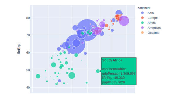
gapminder = px.data.gapminder()
fig = px.scatter(
gapminder.query("year==2007"),
x="gdpPercap",
y="lifeExp",
size="pop",
color="continent",
hover_name="country",
log_x=True,
size_max=60,
height=480,
width=600,
)
Display
Method 1: template for js snippet (Figure is displayed twice)
In this solution display(HTML) is rendering proper plot for the blog, and the fig.show() provides preview while working in the notebook.
plot_json = json.dumps(fig, cls=plotly.utils.PlotlyJSONEncoder)
from jinja2 import Template

template = """
<div id="plotly-timeseries"></div>
<script src="https://cdn.plot.ly/plotly-latest.min.js"></script>
<script>
var graph = {{plot_json}};
Plotly.plot('plotly-timeseries', graph, {});
</script>
"""
data = {"plot_json": plot_json}
j2_template = Template(template)

from IPython.core.display import HTML

# This will be visible in blog post
display(HTML(j2_template.render(data)))
The next cell contains only fig.show(). This is a preview (display() above do not render in a notebook) that can be either manually removed from the final version or can be filtered out using cell tags (remove_cell)
Method 2: Dump plotly figure to HTML string & pass to display.HTML() (no display in notebook)
The plot below is not displayed in the notebook
import IPython

plotly_graph = fig.to_html(include_plotlyjs="cdn")
IPython.display.HTML(plotly_graph)
Method 3. Plotly figure to HTML and display in IFrame
NOTE: this method requires manual copying generated file to output dir (e.g. docs)
with open("plotly_graph.html", "wt") as f:
    f.write(fig.to_html(include_plotlyjs="cdn"))
# iframe with and height should be litte bit larger than those rendered by plotly

IPython.display.IFrame("plotly_graph.html", width=650, height=500)
Bokeh
# see: https://stackoverflow.com/a/43880597/3247880
import pandas as pd
import numpy as np
import bokeh

print("Bokeh version:", bokeh.__version__)
from bokeh.plotting import figure, show
from bokeh.models.sources import ColumnDataSource
from bokeh.io import output_file, output_notebook
from bokeh.models import HoverTool
from bokeh.embed import file_html
from bokeh.resources import CDN

output_notebook()

df = pd.DataFrame(np.random.normal(0, 5, (100, 2)), columns=["x", "y"])
df.head(2)
source = ColumnDataSource(df)
hover = HoverTool(tooltips=[("x", "@x"), ("y", "@y")])
myplot = figure(
    plot_width=600,
    plot_height=400,
    tools="hover,box_zoom,box_select,crosshair,reset",
)
_ = myplot.circle("x", "y", size=7, fill_alpha=0.5, source=source)
# show(myplot, notebook_handle=True)
myplot_html = file_html(myplot, CDN)
IPython.display.HTML(myplot_html)
Altair
For Altair displaying frontends refer to the documentation: Displaying Altair Charts. By default, both Jupyter Notebook and JupyterLab will render if there is a web connection. See the documentation for offline rendering.
import altair as alt
from vega_datasets import data

source = data.cars()

alt.Chart(source).mark_circle(size=60).encode(
    x="Horsepower",
    y="Miles_per_Gallon",
    color="Origin",
    tooltip=["Name", "Origin", "Horsepower", "Miles_per_Gallon"],
).interactive()
import altair as alt
import pandas as pd

# HTML renderer requires a web connection in order to load relevant
# Javascript libraries.
alt.renderers.enable("html")
source = pd.DataFrame(
    {
        "Letter": ["A", "B", "C", "D", "E", "F", "G", "H", "I"],
        "Frequency": [28, 55, 43, 91, 81, 53, 19, 87, 52],
    }
)

alt.Chart(source).mark_bar().encode(
    x="Letter",
    y="Frequency",
    tooltip=["Letter", "Frequency"],
).interactive()
To cite this article:
@article{Saf2019Interactive,
    author  = {Krystian Safjan},
    title   = {Interactive plots for blogging},
    journal = {Krystian's Safjan Blog},
    year    = {2019},
}